

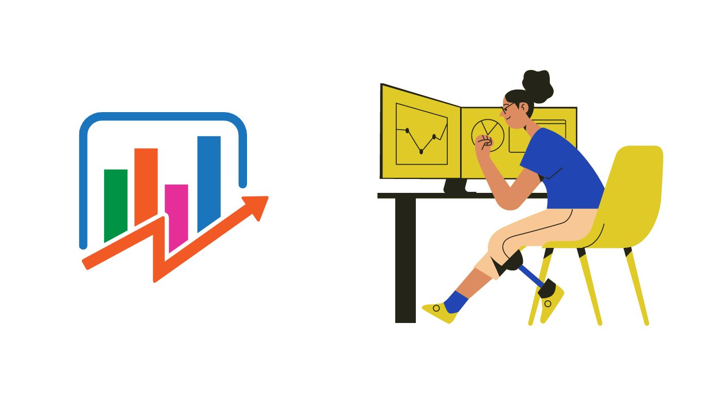
Role of Data Visualization in the recent trend
“YOUR DATA INFORMATION,
OUR VISUALISATION
BUILD YOUR BUSINESS
WITH OUR SERVICE”
'A Picture is Worth a Thousand Words' means a picture is the easiest way to show something rather than describing it in words, as this idiom perfectly fits in Data Visualization. Simplify your complex organizational data with insightful appeals by availing of our Data Visualization Services and Solutions. It helps to compare the- performance of the business over passing years and can also track business goal achievements.
Data Visualization helps to present the essential information in a more visualized form. It adds value by implementing charts and graphs that lead to better decision-making and improve business efficiency. The data-centric approach enables presenting critical data in summarized and easily understandable way.
Our data analytics team uses perfect business intelligence solutions, the best visualization techniques, and the right data platforms to simplify complex data and confusing reports.
Data Visualization helps to present the raw information in a more visualized form and adds value to it by implementing charts, and graphs that lead to better decision-making like discovering new patterns, helping in decision-making, and drawing a better conclusion.
We help to increase the overall efficiency and productivity of your business. it helps businesses to make accurate decisions. It provides a clear and actionable insight into customer trends and satisfaction and brings value to all the internal and external stakeholders from customers to the HR manager, Measure and understand your progress in a very detailed manner, it helps to clearly define a plan and make a clear goal of the organization.
A huge data in a traditional format can cause confusion, cost, and decision-making delay. Using a modern data technique via data visual form helps businesses grow tremendously, eliminate confusion, reduce errors, and prevent wrong decisions. It also helps in making better marketing plans and strategies. A highly interactive data visualization board help to easily identify the strength of the business and helps to overcome the weakness of a business in a very practical manner.
BENEFITS OF A DATA VISUALIZATION
1. ENABLE FASTER DECISION-MAKING:
It helps in framing the business goal of the organization through an insightful picture and generates more critical information about the business. It enables the user to analyze business insight information through dynamic dashboards, interactive reports, graphs, tables, or other visuals quickly and effectively.
2. MORE EFFECTIVE COMMUNICATION:
Through data visualization, stakeholders easily understand without any confusion, or complication and don’t want any technical person to understand data. it gives an accurate and short message in a small period and also provides KPI (key performance indicator) to understand business growth.
PROCESS OF DATA VISUALIZATION
We help every size of business to formulate a data-driven culture where stakeholders can access crucial insights to make correct decisions. Our data scientist team helps throughout the journey of data from collecting data to data visualization.
Our team of data scientists having experience in generating ROI for clients will lead the entire process. We help you build a data-driven culture where every stakeholder has access to vital insights to make better decisions. Our data scientists help you implement a research and development strategy to finalize the best data visualization approach throughout your data journey.
1. Collection of Data
The data Visualization process starts with the collection of data as this is the most important phase of the entire process. We collect the data sets from different departments and the enterprises have to be assured that they are handling the correct data. Also, we do open communication with the companies and ask them about their goals for the particular project.
2. PROCESSING DATA
The second step is to manipulate data and give information. Arranged data in a simpler form that give meaningful, useful, and insightful information about a business.
3. CLEANSING THE DATA
The third step is to cleanse the data, it removes incomplete, irrelevant, and repetitive data. Data is sorted, grouped, and filtered in a necessary format.
4. Models and algorithms
Models and algorithms are applied to the data set. The three types of algorithms are regression, classification, and clustering. The algorithm was created by a data scientist. Data should be put in an algorithm function and then useful; the meaningful output should be revealed.
5. Choose a tool
Choosing a tool for visualization data is a crucial process, select the tool according to the needs of the business organization. It should be kept in mind while choosing a tool that who will be using our analytics tool, will be used by technical or non–technical users.
There are various tools like Tableau, Power BI, MS Excel, etc. Finally, consider the tool which is best for the business organization, licensing fees, and subscriptions should also be considered while choosing a tool.
6. Select a chart type and create visuals
The first step is to search all the available options for presenting your data. We choose the right fit according to data information, audience, and purpose of the business organization.
There are several charts for Data visualization: Tables, line charts, bar charts, pie – charts, tree maps, heat maps, scatterplots, and bubble charts. Every chart has its use like line charts used when showing trends over time, Bar charts used when comparing different categories, Tables used when to show more information in a structured way, and pie charts when comparing different categories and driving a relationship in percentage form as a whole.
Treemaps are used when to represent a hierarchical relationship and compare different categories, when data represent matrix form with added colors, then used heatmaps. When depicting two-variable relationships with axis in the numeric form then used scatterplots. A bubble chart is used when a third variable is included in bubble form and easily presents variation between data items.
WHY CHOOSE DATA VISUALIZATION SERVICES?
Our data visualization services help to get insight information about your business in a simpler form. It helps your business to grow at an advanced level. Data visualization services help to grow revenue in a business, better analysis of the business organization, identification of different patterns, customer trends, and satisfaction helps in decision making, and help companies to identify improvement areas. It supports stakeholders in sales volume and future growth of the business.
1. TO INCREASE BUSINESS PROFIT
Our data visualization services help your business to grow tremendously. It helps to get an insight picture of your business and draw a meaningful and clear conclusion. Business growth entirely depends on decisions. If data is driven in a simpler form, then taking the best decision is not a big task.
2. HELP BUSINESSES TO FIND UPCOMING OPPORTUNITIES
Our data visualization services help the business get detailed information through visuals. By visualization it is very easy to compare different categories, different years help us to find customer trends and satisfaction.
As we know the latest trend of the customers by visuals then, we also predict future trends by analyzing data in a detailed manner. Hence, it helps to forecast the business to find valuable opportunities.
3. IDENTIFY CUSTOMER TRENDS AND SATISFACTION
Our data visualization services help the business to identify and understand customer preference needs and decision-making. It helps to identify the purchasing capacity of the customer in the same or different areas, how long their decision making, what type of product they repeatedly purchase, what type of customer purchasing your product, etc. we help businesses to make better decisions and easily track customers.
4. PRESENT ACCURATE DATA
Our services provide data visualization, enabling the visual sorting, grouping, and filtering of the data. It provides accurate, deeper insight and helps to make the best decision on a business problem.
5. INCREASES PRODUCTIVITY AND EFFICIENCY
Our data visualization services help the organization remove incomplete, irrelevant, repetitive data and make the data error-free. A better and quick decision would be taken by managers, and internal and external stakeholders, and comparison became very easy through visual representation. It draws the best conclusion from it. It saves a lot of time therefore; business productivity and efficiency would be increased.
Data visualization helps in improving the customer experience. It allows us to get to know the customer's tastes and preferences regarding specific products or services. These data figures provide insightful actions to businesses and they can change the practices according to the preference of customers. It also helps in identifying key performance areas (KPIs) they know about their tastes and preferences regarding specific products or services.
FAQ’s
1. What is Data Visualization?
Data Visualization Techniques use charts and graphs to visualize large amounts of complex data. Visualization provides a quick, easy way to convey concepts and summarize and present large data in easy-to-understand and straightforward displays, which enables readers to insightful information. With the help of Data Visualization Techniques, enterprises can see the overview of their unstructured enterprise data in a better way.
2. How does Data Visualization work?
Data Visualization is one of the major pillars of Data Science. It uses shapes, lines, and other figurative approaches to portray numbers or data. Multiple techniques such as Tableau, Microsoft Power BI, Domo, Sisense, and Looker can insightfully present data. Bar charts, pie charts, scatter plots, histograms, and line charts are mainly used to represent complex information in more visual form.
3. What are a data visualization dashboard and its importance?
A dashboard is a data visualization tool that tracks, analyses, and displays KPIs, metrics, and critical data points. Dashboards empower both technical and non-technical users to understand and leverage business intelligence to make more informed decisions. Users actively participate in the analytics process by compiling data and visualizing trends or occurrences, and uncovering an objective view of performance metrics that can be immediately understood.
The importance of data visualization is as follows:
Visualize multiple KPIs at once
Make data easier to understand
Increase accessibility and collaboration
Create reports on the fly.
4. What is the major difference between data visualization and a data visualization dashboard?
The main difference between basic data visualization and dashboard data visualization revolves around how frequently data is updated. While data visualizations are just generated from data, a data visualization dashboard is regularly updated according to dataset modifications. Plus, dashboards enable easier comparisons between models driven by databases of vastly different sizes and types.
2 Replies to “Role of Data Visualization in the recent trend”
Daftar Slot Gacor Online Terpercaya 2023 melalui link alternatif https://www.bobets-slot.com
Selain merawat rambut dari luar dengan ramuan tradisional dan minyak zaitun, memperkuat akar rambut dari dalam juga penting, misalnya dengan mengonsumsi makanan yang kaya nutrisi dan menjaga kehidupan sehari-hari yang sehat.